Tranquil Tones: 5 Calming Colors to Create a Serene Home. Creating a tranquil and spa-like space in your home is a wonderful idea for promoting relaxation and serenity. When it comes to choosing Paint Colors that evoke a soothing atmosphere, there are several options to consider. Here are a few stunning paint colors that can help create a tranquil environment.
Soothing Shades for Your Home

In today’s increasingly stressful life, many of us are eager to create our homes as peaceful and relaxing sanctuaries.
Thoughtful color selection is an effective way to achieve a sense of serenity. Sue Wadden, the director of color marketing for Sherwin-Williams, recommends painting large swatches of your two or three favorite shades to observe how the colors shift with natural light and how they appear under artificial lighting.
“By spending time with each color, you’ll gain a better understanding of what creates a calming mood in a room and be able to make your final choice,” says Wadden.
Seize the Gray by Clare
A light gray is an ideal foundation for a calm room.
This subtle shade softens the space without making it too dim, allowing you to decorate the room according to your preferences. Clare’s Seize the Gray is a perfect option for a serene gray. Since it doesn’t have any undertones, it is versatile for any style of room and can adapt to various lighting conditions.
Headspace by Clare

The color light blue has the remarkable ability to instantly add brightness to any room it graces.
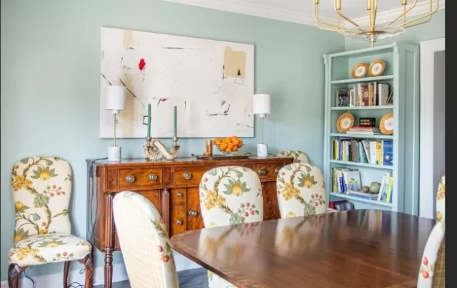
One shade that captures this effect perfectly is Headspace by Clare. With its soft and airy quality, this universally loved color creates a calm and uplifting atmosphere. The appropriately named Headspace by Clare brings a sense of serenity and tranquility, making it an ideal choice for those seeking a soothing and light-filled space.
Its gentle hue evokes a sense of openness and expansiveness, reminiscent of clear skies and tranquil waters. The softness of Headspace by Clare invites natural light to dance across the walls, illuminating the room with a subtle glow.
Whether used as a primary color or as an accent, Headspace effortlessly infuses a space with a refreshing and rejuvenating vibe. Its versatility allows it to complement various design styles, from modern to coastal, creating a serene backdrop for any decor.
In bedrooms, Headspace fosters a peaceful ambiance, promoting relaxation and restful sleep. In Living Areas, it creates an inviting and harmonious atmosphere, encouraging moments of tranquility and reflection. Even in workspaces, the calming nature of Headspace can help alleviate stress and enhance focus.
The light blue hue also has a psychological effect, known to promote a sense of clarity, calmness, and mental well-being. It can be particularly beneficial in spaces where mindfulness, meditation, or creativity are encouraged.
Embrace the brightness and serenity that Headspace by Clare brings, and allow its gentle touch to uplift your surroundings. Whether you’re seeking a sanctuary of calm or a space for inspiration, this universally loved shade is sure to create a harmonious and soothing environment that rejuvenates the spirit.
Truly Taupe by Valspar
Taupe is a blend of brown and gray, but it should not be confused with beige.
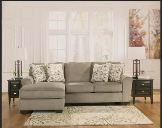
This shade is typically richer and darker, with warm undertones. Wadden suggests the “cocoon feeling” that a taupe paint can evoke. Truly Taupe is warm and easy to coordinate with neutral-colored furniture, as well as Valspar’s Alabaster or Nice White.
Euphoric Lilac by Valspar

Pale purple, such as lavender or lilac, is an excellent choice if you want to depart from neutral colors.
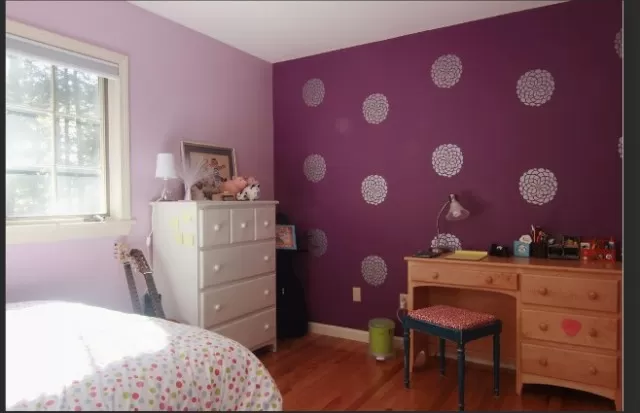
A shade like Euphoric Lilac by Valspar provides a soothing effect while still adding a splash of color and a joyful vibe. Paint your bedroom or sitting room walls with this satin finish for a calming retreat.
*The information is for reference only.