5 Paint Colors That Have Stood the Test of Time. When it comes to choosing a color scheme for your home, it can be helpful to draw inspiration from the past. Certain colors have stood the test of time and can provide a timeless and sophisticated look to your space. Here are five classic shades that are guaranteed to be a reliable choice.
Pantone Sand Dollar (2006) – A Timeless Organic Neutral with a Calming Presence

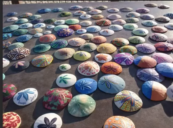
Pantone Sand Dollar, introduced in 2006, embodies a luminosity reminiscent of a seashell that will never lose its appeal.
This captivating and organic neutral hue exudes a natural vibe that transcends trends and remains eternally stylish. Perhaps Pantone’s intention was to provide a calming antidote during the subprime mortgage crisis, as Sand Dollar emanates a soothing presence.
The name itself captures the essence of both sand-like qualities and the delicate nature of money, how easily it can slip away. With Pantone Sand Dollar, you can bring a sense of tranquility and timelessness to your space, creating a serene atmosphere that endures the test of time.
Behr Black Lacquer (2013) – A Luxurious Deep Gray for Timeless Sophistication
When it comes to black paint, the starkness can sometimes be overwhelming.
However, Behr’s Black Lacquer from their 2013 Color Trend Collection offers a stylish alternative. This deep and rich gray hue exudes sophistication and elegance, adding a touch of timeless beauty to any space. Black Lacquer serves as a versatile neutral that effortlessly complements jewel tones, cool whites, and lighter grays. Whether used as an accent color or as the main hue, this luxurious shade brings a sense of refinement and depth to your interior design palette. Embrace the allure of Behr’s Black Lacquer and create a space that exudes sophistication and style.
Valspar Wedding Cake (2017) – A Misty and Warm White for Timeless Elegance

White is an eternal classic, but with countless shades to choose from, finding the perfect one can be a challenge.
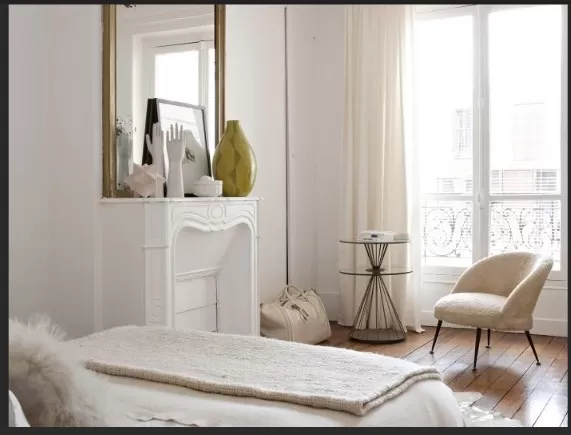
Enter Valspar’s Wedding Cake, a delightful color from their 2017 collection. This particular white hue possesses a subtle touch of warm gray, creating a light and misty ambiance that adds depth and sophistication to any space.
With Valspar’s Wedding Cake, you can achieve a timeless elegance that effortlessly complements a wide range of interior styles. Whether used on walls, trim, or furniture, this misty white shade is sure to create a serene and inviting atmosphere.
Benjamin Moore Breath of Fresh Air (2014) – Embrace Serenity with this Calming Pale Blue
When Benjamin Moore introduced their 2014 Color of the Year, they aimed to immerse people “fully in the moment.
” And there’s no doubt that this captivating, pale blue shade has the ability to do just that. Benjamin Moore’s Breath of Fresh Air is a dreamy, airy color that effortlessly infuses tranquility into any room. Ideal for living rooms, bedrooms, and virtually any space in need of a soothing touch, this hue truly lives up to its name. With Breath of Fresh Air, you can create an atmosphere of serenity and embrace a sense of calm within your living spaces.
Pantone True Red (2002) – A Vibrant Accent Color for Your Dining Room

Red is an unbeatable choice for a striking accent color.
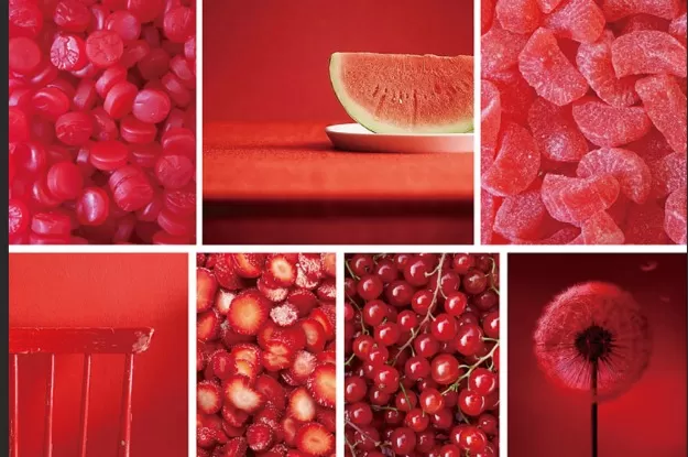
Pantone True Red (2002), a shade that exudes patriotism and symbolizes life and good fortune, beautifully enhances the ambiance of a dining room. Whether used on an accent wall or incorporated into the decor, this vibrant hue truly stands out and adds a touch of sophistication to the space.
*The information is for reference only.