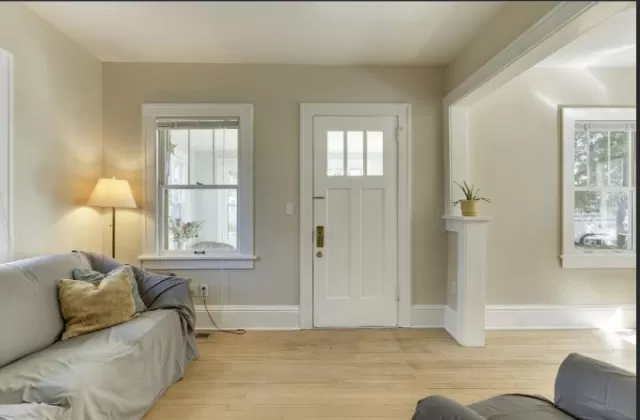
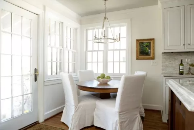
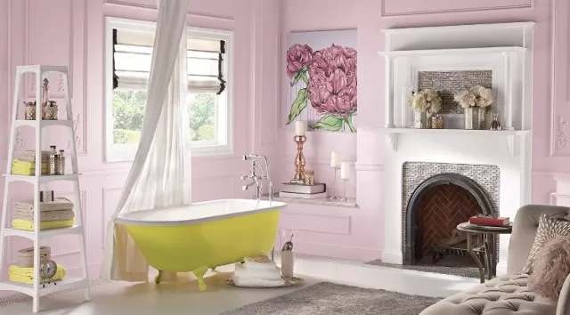
Interior Designer-Approved Neutral Paint Colors. While bright hues infuse energy and vibrancy, neutrals offer the opportunity to craft miniature oases in each room of your home. Dive into a world of tranquility by incorporating relaxed tones alongside lush fabrics and minimalist framed sketches, creating a sense of luxury. Alternatively, use subtle shades like white, tan, and gray to complement vibrant textiles and captivating artwork, allowing the neutrals to enhance the visual appeal.
These neutral Paint Colors, with undertones spanning from serene blues to calming greens to barely-there yellows, not only complement other shades when used for woodwork and trim but also stand confidently as primary hues. Whether you’re aiming for a minimalist haven or a canvas for diverse artwork, these neutral shades are your key to a versatile and sophisticated interior. Step into the realm of tranquility and shop your favorite neutral hues to transform your space into a haven of timeless elegance.
Farrow & Ball Ammonite Modern Emulsion Interior Paint: Timeless Elegance Inspired by Ancient Forms

Drawing inspiration from the fossils of spiral-shelled ammonites that once graced the Earth over 65 million years ago, Farrow & Ball presents the Ammonite Modern Emulsion Interior Paint.
This earthy and timeless gray hue encapsulates the rich history of these ancient creatures, offering a color that resonates with both the past and the present.
Ammonite, with its neutral and Versatile character, serves as a sophisticated canvas for interior and exterior spaces.
The paint is available in eight durable, water-based finishes, providing a range of options to suit various design preferences and applications.
Immerse yourself in the understated elegance of Ammonite, where the essence of ancient forms meets contemporary design.
Whether adorning your interior walls or gracing the exterior of your home, this Farrow & Ball creation invites you to embrace a color that transcends time, adding a touch of timeless grace to your living spaces.
Clare Like Buttah Interior Paint: A Luscious and Soothing Buttery Beige
Experience the luxurious charm of Clare Like Buttah Interior Paint, expertly described by Clare’s paint specialists as a “buttery beige.
” This shade, with its soothing undertones and luscious depth, introduces a subtle warmth that transforms bedrooms, offices, and living spaces into havens of comfort and style.
Not only does Like Buttah captivate with its aesthetics, but it also prioritizes the well-being of your indoor environment.
The paint is GREENGUARD certified, ensuring healthier indoor Air Quality. Additionally, its self-priming nature simplifies the painting process, while its washable feature adds a practical touch, making maintenance a breeze.
Indulge in the harmonious blend of aesthetics and functionality that Clare Like Buttah Interior Paint brings to your living spaces.
Elevate your surroundings with the gentle allure of this buttery beige, creating an atmosphere of timeless elegance and unparalleled comfort.
Benjamin Moore White Dove Advance Interior Paint: Clean, Classic, and Timelessly Popular

Discover the enduring appeal of Benjamin Moore’s White Dove Advance Interior Paint, celebrated as a “clean and classic” white that has become one of the brand’s most popular shades.
Renowned for its versatility, White Dove is not limited to enhancing moldings and trim. It also stands confidently on its own, serving as a “light and luminous” wall color that effortlessly elevates any space.
White Dove’s timeless charm extends beyond being a complementary shade for moldings and trim—it takes center stage, creating an atmosphere of purity and sophistication.
The versatility of this white hue is particularly notable, seamlessly complementing a variety of wall colors with undertones of gray, red, and green.
Elevate your interior spaces with the clean and classic allure of Benjamin Moore White Dove Advance Interior Paint.
Whether used as a standalone wall color or as an elegant complement to other hues, White Dove brings a sense of brightness and timelessness to your home, creating an atmosphere that is both fresh and enduring.
Sherwin-Williams Pure White Satin Emerald Interior Paint: Versatile Elegance with a Cozy Undertone
Immerse yourself in the timeless and well-loved charm of Sherwin-Williams Pure White Satin Emerald Interior Paint.
This versatile white shade is crafted with a subtle yellow undertone, adding a touch of warmth that transforms your space into a cozy haven without feeling stark or bare.
The beauty of Pure White lies in its adaptability, making it an ideal choice for a range of design styles.
Whether used as the main wall color or paired with warm grays, bold navy, or organic greens, this shade proves to be a foolproof complement to any color palette. Its gentle undertone enhances the overall atmosphere of your interior, creating an inviting and comfortable ambiance.
Experience the elegance and flexibility of Sherwin-Williams Pure White Satin Emerald Interior Paint as it effortlessly becomes a backdrop for your personal style.
With its cozy undertone and timeless appeal, Pure White sets the stage for a space that is both sophisticated and welcoming, adapting seamlessly to your unique design preferences.
Behr Silver Feather Interior Satin Paint: A Versatile Blend of Celadon and Silver-Gray Elegance

Dive into the tranquil sophistication of Behr Silver Feather Interior Satin Paint, where the subtle dance of celadon tones and silver-gray hues creates a uniquely versatile shade.
While interior designers often champion green as a neutral, the distinction lies in the delicate balance achieved by Silver Feather.
Unlike more specific green tones like emerald, pine, or Kelly, Silver Feather presents a neutrality that rivals the classic appeal of white, tan, or beige.
The faint celadon tones evoke the serenity of the great outdoors, seamlessly blending the tranquility of nature with the modern elegance of silver-gray undertones. This harmonious fusion places Silver Feather firmly in the “goes-with-anything” category, offering a level of adaptability that makes it a standout choice.
Transform your living spaces with the refined beauty of Behr Silver Feather, where the subtle interplay of celadon and silver-gray hues brings a sense of peace and versatility.
This paint becomes more than a color; it becomes a canvas for your design vision, effortlessly complementing a variety of styles and color palettes while infusing your home with an understated yet sophisticated charm.
*The information is for reference only.